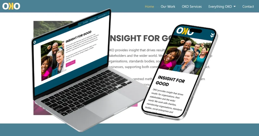
Discover how we designed and built a professional market research website for OKO, creating a streamlined online presence that showcases their expertise, clients and services through an innovative single page design.
OKO Website Case Study
The OKO Website Case Study demonstrates how a carefully planned website structure can deliver a large amount of information whilst remaining simple and intuitive for visitors.
OKO is a specialist market research agency working with charities, not-for-profit organisations, public sector bodies and organisations looking to create positive social impact through evidence-based research and insight.
The challenge was to create a professional Market Research Website that communicated credibility, expertise and experience whilst remaining easy for visitors to navigate.
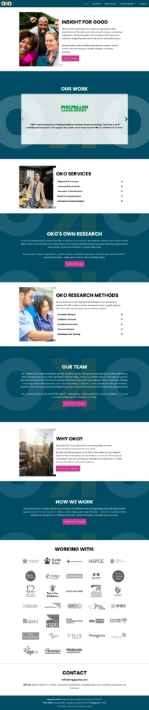
Rather than building a traditional multi-page website, we created a highly effective Single Page Website that uses anchor navigation to guide visitors smoothly through the content.
The result is a website that feels much larger than it actually is whilst providing an exceptional user experience across all devices.
View the website: https://oko.agency/
The Brief
OKO needed a website that would:
- Showcase their research expertise
- Highlight their services and methodology
- Demonstrate sector knowledge
- Build trust with prospective clients
- Showcase client organisations
- Generate enquiries
- Work seamlessly across all devices
- Present a professional and credible image
Most importantly, the website needed to communicate expertise whilst remaining easy for visitors to use.
A Market Research Website Built Around Clarity
The new Market Research Website was designed to clearly communicate what OKO does and who they help.
The website introduces visitors to the organisation, outlines the services available, explains research methodologies and demonstrates the impact of the work they deliver.
Every section has been carefully structured to guide visitors through the information in a logical and engaging way.
This helps create confidence whilst reinforcing OKO’s expertise within the sector.
A Single Page Website That Feels Much Larger
One of the most interesting aspects of this project is that the entire website is built as a Single Page Website.
Rather than requiring visitors to move between multiple pages, the website uses anchor links to smoothly navigate between sections.
This approach provides a seamless browsing experience whilst allowing visitors to access information quickly and efficiently.
The result is a website that feels much larger than a traditional single page design whilst remaining simple to navigate.
The anchor navigation allows visitors to jump directly to key sections including services, research methods, client information and contact details without unnecessary clicks.
A Consultancy Website Built Around Expertise
The website positions OKO as a trusted partner for organisations looking to better understand their audiences, communities and stakeholders.
As a Consultancy Website, it was important that the content communicated both credibility and experience.
The website highlights OKO’s strengths in:
- Insight and Strategy
- Research Design
- Qualitative Research
- Quantitative Research
- Workshops and Training
- Implementation Support
This helps visitors quickly understand the breadth of services available whilst reinforcing the organisation’s expertise.
A Charity Website Supporting Social Impact
Much of OKO’s work focuses on charities, not-for-profit organisations and organisations creating positive social change.
The Charity Website therefore needed to reflect these values whilst maintaining a professional and credible appearance.
Throughout the website, visitors can see examples of organisations that have worked with OKO, helping build trust and demonstrate real-world experience.
The client showcase includes recognised organisations such as:
- Macmillan Cancer Support
- NSPCC
- Guide Dogs
- Age UK
- Samaritans
- Save the Children
- World Vision
- Royal Horticultural Society
- The Economist
- MHRA
Featuring these organisations helps reinforce the calibre of clients OKO supports and demonstrates the trust placed in their expertise.
Designed For User Experience
One of the biggest advantages of the website is its simplicity.
Visitors can move naturally through the content without feeling overwhelmed by complicated menus or multiple layers of navigation.
The anchor navigation system keeps everything accessible whilst maintaining a clean and modern design.
This creates a user experience that feels effortless whilst still delivering substantial information.
Mobile Responsive Across All Devices
The website has been fully optimised across:
- Desktop Computers
- Laptops
- Tablets
- Smartphones
Ensuring visitors can access information quickly and easily regardless of device.
Key Features Delivered
Market Research Website Design
A professional website designed around credibility and expertise.
Single Page Website Structure
Creating a seamless browsing experience through anchor navigation.
Consultancy Website Content
Clearly communicating services and capabilities.
Charity Website Positioning
Reflecting the values and experience of the organisation.
Client Showcase
Highlighting well-known organisations and successful partnerships.
Mobile Responsive Design
Fully optimised across all modern devices.
Future Growth Potential
Easy to expand as the organisation evolves.
SEO-Friendly Structure
Built to support future visibility and online growth.
The Results
The completed website provides OKO with a professional online presence that reflects the quality of their work and the organisations they support.
The website successfully delivers:
- Clear communication of services
- Improved user experience
- Stronger credibility
- Enhanced client visibility
- Mobile-friendly access
- Simplified navigation
- Increased enquiry opportunities
Most importantly, the website demonstrates that a Single Page Website can still provide a rich, informative and highly professional experience when carefully planned and executed.
What Jeremy Had To Say
⭐⭐⭐⭐⭐
“Gift of the Gab are just brilliant. Absolutely brilliant. Helpful, patient, thoughtful, imaginative, focused on solutions, and lovely people to work with. I genuinely couldn’t recommend them highly enough.”
Jeremy
Feedback like this is always wonderful to receive and reflects the collaborative approach that helps us create websites tailored to the needs of every client.

Need A Market Research Website?
Whether you’re a research agency, consultancy, charity, not-for-profit organisation or professional services business, a professional website can help communicate your expertise and generate new opportunities.
We create Market Research Websites, Charity Websites, Consultancy Websites and Single Page Websites that are designed to showcase your organisation whilst providing an excellent user experience.